一、假设高度已知,请写出三栏布局,左右栏为300px,中间自适应
1.1 demo
-
实现的方法有:
-
浮动布局
思路一:html格式是左右中栏排序,左栏左浮动,右栏右浮动,中间不浮动
 .float .left {
    float: left;
}
.float .right {
    float: right;
}
思路二:html格式是中左右栏排序,三栏都是左浮动,中间栏设置margin: 0 300px; 左栏设置margin-left: -100%; 右栏设置margin-left: -300px;
- 定位布局
思路:左中右三栏都设置为绝对定位元素,左栏设置left值为0,top值为0;中栏设置left值为300px,top值为0;右栏设置right值为0,top值为0
.position .left {
    position: absolute;
    left: 0;
    top: 0;
}
.position .center {
    position: absolute;
    left: 300px;
    top: 0;
    right: 300px;
}
.position .right {
    position: absolute;
    right: 0;
    top: 0;
}
- 弹性布局
思路:父元素设置display:flex,左右栏设置宽度为300px,中间栏设置flex: 1
 .flex .left-center-right{
    display: flex;
}
.flex .center {
    flex: 1;
}
- 表格布局
思路:父元素设置display: table;三栏都设置display: table-cell,左右两栏设置宽度为300px
 .table .left-center-right{
    display: table;
}
.table .left,
.table .center,
.table .right {
    display: table-cell;
}
- 网格布局
思路:父元素设置display: grid; grid-template-rows: 100px; grid-template-columns: 300px auto 300px;
.grid .left-center-right {
    display: grid;
    grid-template-rows: 100px;
    grid-template-columns: 300px auto 300px;
}
1.2 对题目的引申
- 貌似将这道题目的5种解决方案说出来就完美了,其实不是的,面试官很大可能都会进行延伸的!
- 这5种方案各自有什么优缺点
- 如果将“假设高度已知”去掉后,即不仅要考虑水平方向,还要考虑中间方向的高度问题,
- 比如:中间的高度撑开了,那么也需要左侧和右侧都跟随撑开,那么刚才写的5种方案,还可以适用?哪个已经不可以用了?
- 这5种方案的兼容性如何?真正到业务中使用,哪个是最适用的?
1.3 5种方案优缺点
| 布局名称 | 优点 | 缺点 |
|---|---|---|
| 浮动布局 | 兼容性较好 | 1. 不能处理居中问题 2. 要清除浮动 |
| 定位布局 | 兼容性较好,快捷 | 由于脱离了文档流,那么其后代元素也会跟随其脱离文档流,导致有效性、可使用性较差 |
| 弹性布局 | 主要解决了浮动布局和定位布局的不足 | 有兼容性问题(IE10+) |
| 表格布局 | 兼容性若在使用flex布局时,想兼容IE8、9,可以考虑使用table布局 | 1. 操作繁琐,对SEO不优化,性能较差 2. 若中间div的高度超出时左右div的高度会跟着变化 |
| 网格布局 | 由之前的960栅格框架转化成css内置语法支持,简易了很多,且是一门新的技术 | 有兼容性问题 |
1.4 高度已知去掉
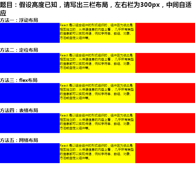
- 结果如下图:

- 从上图可以发现:只有
flex布局和弹性布局仍然可以使中间自适应,而浮动布局、定位布局和网格布局都不行。
- 除此之外,会发现浮动布局那里,红色框框圈着的文字在左栏(蓝色栏)下方,而非处与正中间
- 原因是:因为左栏(蓝色栏)和中间栏(黄色栏)都是浮动元素,对于中间栏来说,其内容也左浮动的时候,被蓝色块挡住了,所以被挡住的文案就会在中间排, 那么当内容超出以后,前面就没有东西挡住它了,自然而然就会处于红色框框圈着的地方了。
- 如果想红色框框的内容仍然处于中间的位置,如何做?
- 解决方法:为中间栏新建一个
BFC
二、题目的延伸
2.1 页面布局的变通
- 三栏布局
- 左右宽度固定,中间自适应
- 上下高度固定,中间自适应
- 两栏布局
- 左宽度固定,右自适应
- 右宽度固定,左自适应
- 上高度固定,下自适应
- 下高度固定,上自适应
2.2 上下高度固定,中间自适应
- 方法一:定位布局【demo】
* {
    padding: 0;
    margin: 0;
}

.layout {
    width: 100%;
}
.layout .top-center-bottom > div {
    width: 100%;
}
.position .top {
    position: absolute;
    left: 0;
    top: 0;
    height: 100px;
    background: blue;
}
.position .center {
    position: absolute;
    left: 0;
    top: 100px;
    bottom: 100px;
    background: yellow;
}
.position .bottom {
    position: absolute;
    left: 0;
    bottom: 0;
    height: 100px;
    background: red;
}
- 方法2:弹性布局【demo】
.top-center-bottom {
    display: flex;
    flex-direction: column;
}
.flex .top {
    height: 100px;
    background: blue;
}
.flex .center {
    flex: 1;
    background: yellow;
}
.flex .bottom {
    height: 100px;
    background: red;
}
- 方法3:表格布局【demo】
div中必须有内容才行!
.top-center-bottom {
    display: table;
}
.top-center-bottom > div {
    width: 100%;
}
.table .top {
    display: table-row;
    height: 100px;
    background: blue;
}
.table .center {
    display: table-row;
    background: yellow;
}
.table .bottom {
    display: table-row;
    height: 100px;
    background: red;
}
- 方法4:网格布局【demo】
 .top-center-bottom {
    display: grid;
    grid-template-rows: 100px auto 100px;
    grid-template-columns: 100%;
}
.grid .top {
    background: blue;
}
.grid .center {
    background: yellow;
}
.grid .bottom {
    background: red;
}
2.3 左宽度固定,右自适应
- 浮动布局:
只要左栏浮动即可,右栏直接设置margin-left: 300px即可
2.4 右宽度固定,左自适应
- 浮动布局:先右后左
<h2>方法一:浮动布局</h2>
<section class="layout float">
    <article class="left-right clearfix">
        <div class="right"></div>
        <div class="left">
            React 是以组合组件的形式组织的,组件因为彼此是相互独立的,从传递信息的内容上看,
            几乎所有类型的信息都可以实现传递,例如字符串、数组、对象、方法或自定义组件等。
        </div>
    </article>
</section>
- 右栏右浮动,左栏设置margin-right: 300px
 .float .left {
    margin-right: 300px;
}
.float .right {
    float: right;
}
2.5 上高度固定,下自适应
- 方法1:定位布局【demo】
 .position .top {
    position: absolute;
    left: 0;
    top: 0;
    width: 100%;
    height: 100px;
    background: blue;
}
.position .bottom {
    position: absolute;
    left: 0;
    top: 100px;
    width: 100%;
    background: red;
}
2.6 下高度固定,上自适应
- 方法1:定位布局【demo】
  .position .top {
    position: absolute;
    left: 0;
    top: 0;
    width: 100%;
    background: blue;
}
.position .bottom {
    position: absolute;
    left: 0;
    bottom: 0;
    width: 100%;
    height: 100px;
    background: red;
}